Avantime

Avantime

Web Design

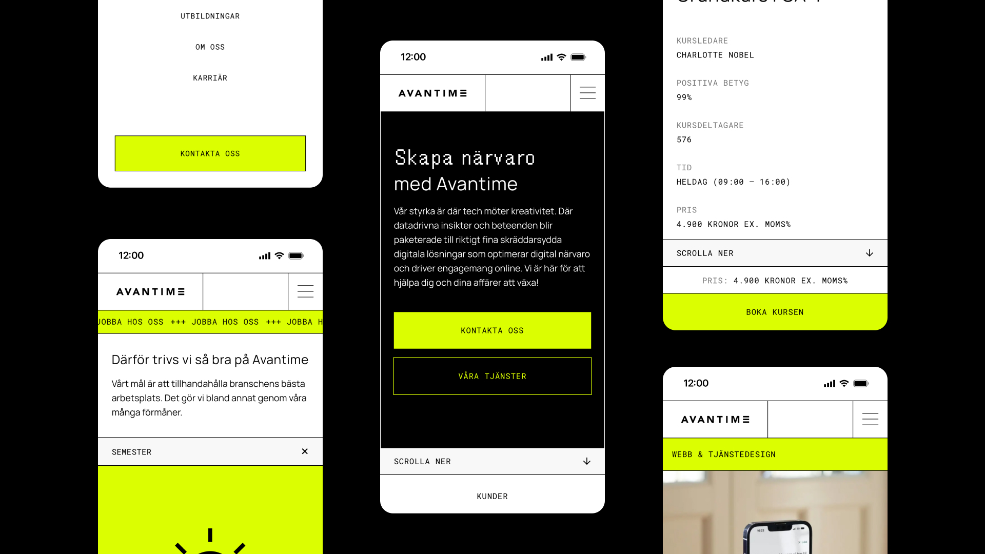
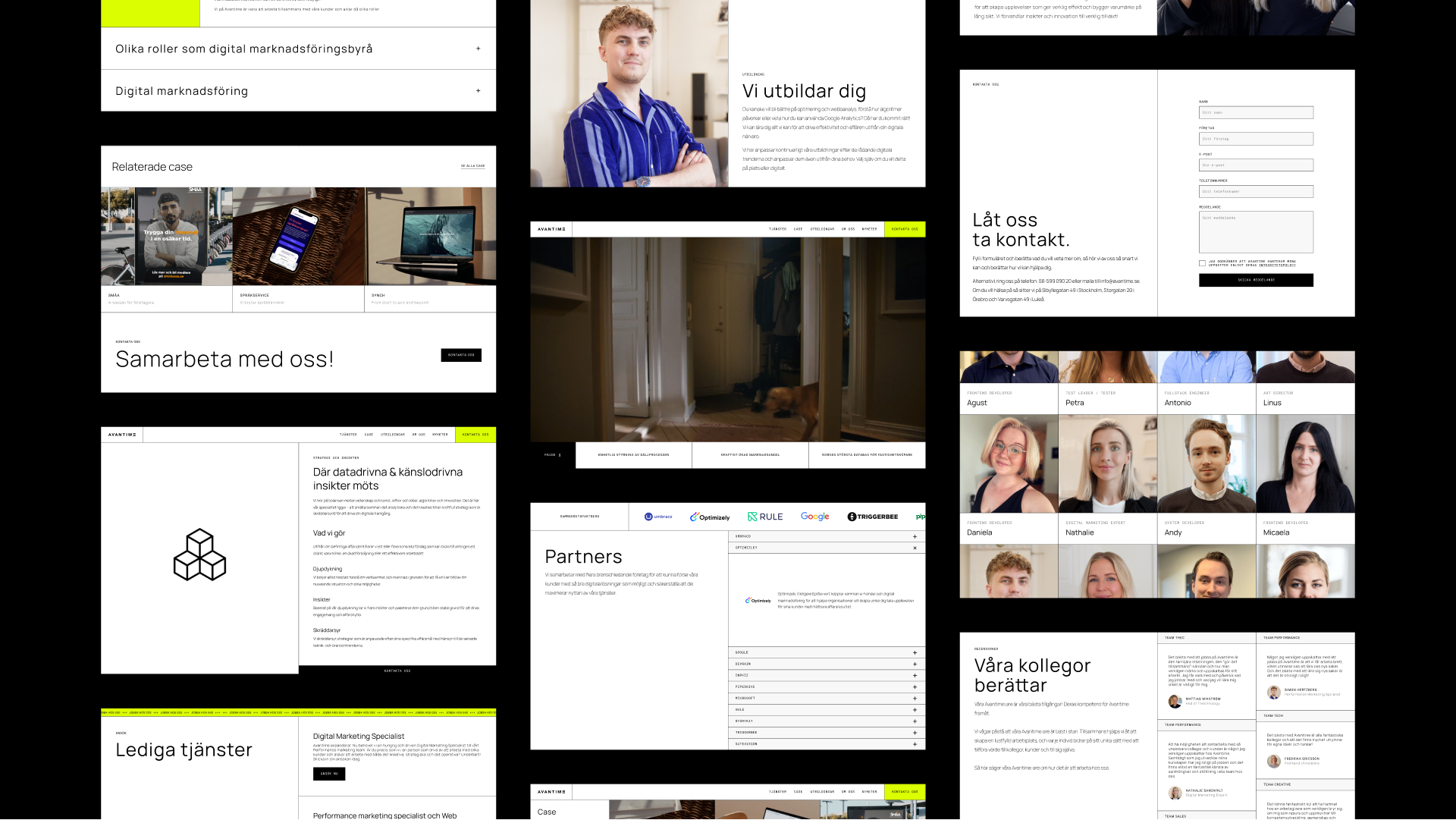
In 2023, I did a thorogh job of modernizing the visual expression of Avantime's website.

The task was to reflect an updated mission and vision for the organization and develop an aesthetic that aims to communicate the agency's technical expertise combined with creative thinking.

Find more info and team further down.

1
Start-2
2
Icons
Icons-1

Typography

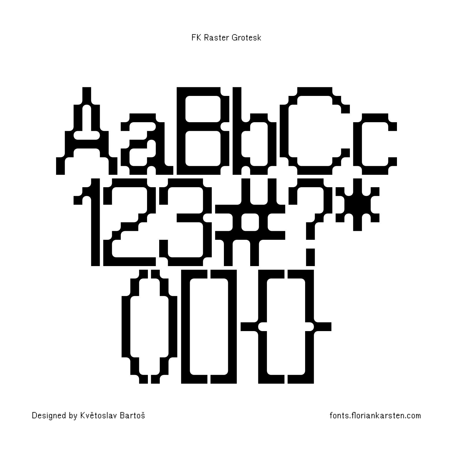
FK Raster Grotesk
FK Raster Grotesk is a pixel-based sans-serif typeface, sharpest at the 12-pixel size. Its Compact variant partially abandons the pixel grid and serves as a tightly spaced display typeface, carefully kerned to leave no superfluous gaps. The variable font smoothly transitions between sharp, pixelated form to completely rounded shapes, creating strong contrasts between the two states.
 
FK Raster Grotesk supports Latin Extended-A character set (i.e. Western European, Central European and Southeastern European languages) and several OpenType features.
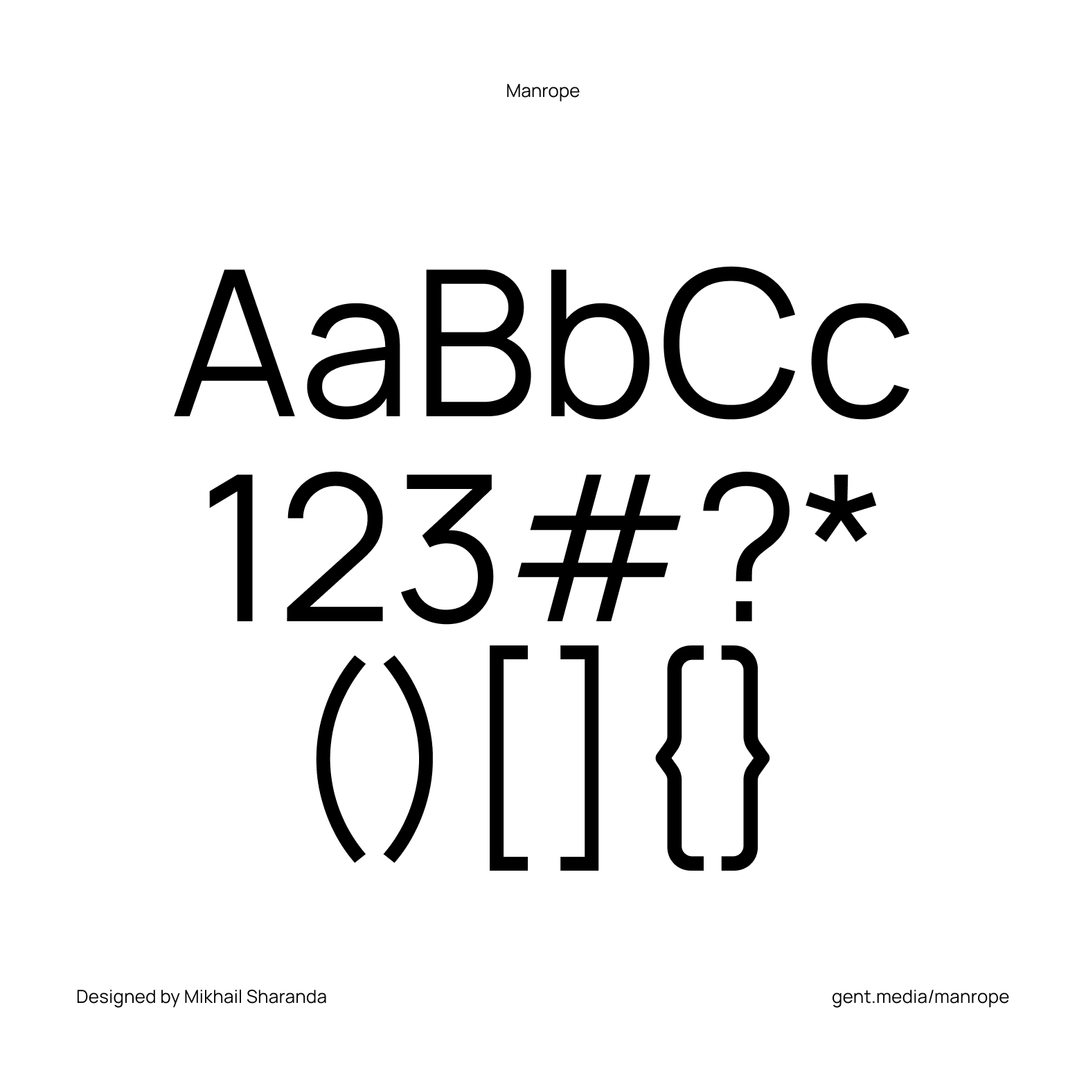
Manrope
Manrope is an open-source modern sans-serif font family, designed by Mikhail Sharanda in 2018. In 2019, Mirko Velimirovic worked with Mikhail Sharanda to convert Manrope into a variable font.

Manrope font has wide language support, covering most Latin and Cyrillic languages.
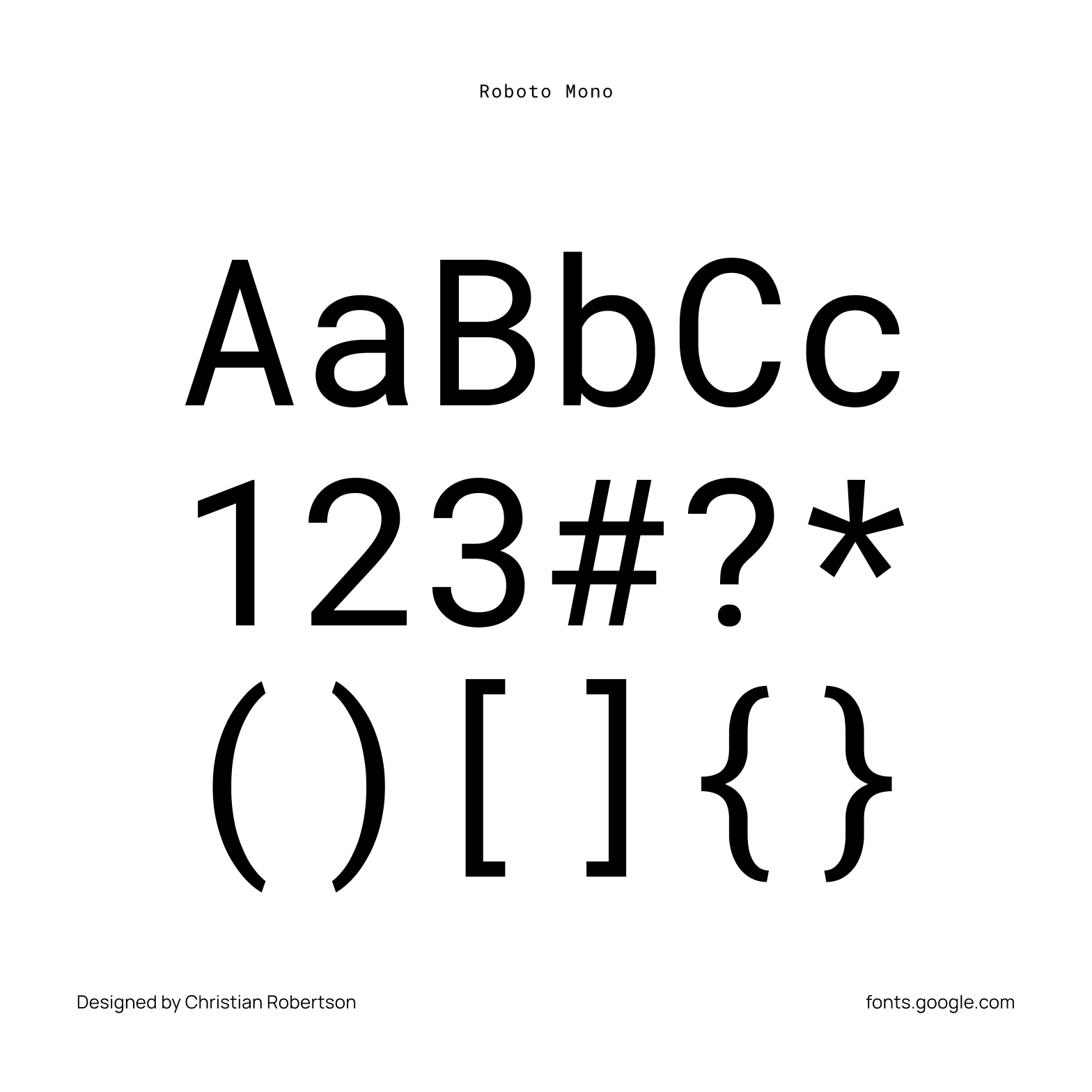
Roboto Mono
Roboto Mono is a monospaced addition to the Roboto type family. Like the other members of the Roboto family, the fonts are optimized for readability on screens across a wide variety of devices and reading environments. While the monospaced version is related to its variable width cousin, it doesn’t hesitate to change forms to better fit the constraints of a monospaced environment.

For example, narrow glyphs like ‘I’, ‘l’ and ‘i’ have added serifs for more even texture while wider glyphs are adjusted for weight. Curved caps like ‘C’ and ‘O’ take on the straighter sides from Roboto Condensed.

Color Palette

Colors

Team

Client / Agency
Avantime Group

Project Leader
Louise Skogehall

Art Director / Design
Linus Lindgren

Content Specialist
Pernilla Mårtensson

Developer
Daniela Waara

Creative Strategist
Gabriella Boije
AvantimeWeb Design

SpråkserviceWeb Design

VerdisWeb Design / E-commerce
Språkservice OnlineService design
StenvalvetWeb Design